Overview
Maestro controls are accommodated into two groups: Basic and Complex Controls. Below is a list and description of the Basic Controls available in the Screen Designer.
Basic Controls
Click on an item below for more information
| Address Lookup – control that provides address options by the means of type ahead search. |
| Basic Dropdown – control that allows the user to choose one value from a list. When a drop-down list is inactive, it displays a single value.
When activated, it displays (drops down) a list of values, from which the user may select one. One of the values is the ‘Empty value’ that is used to delete selected value(s). |
| Button – control that allows the user to add/remove buttons and assign actions on them. |
| Checkbox – control that allows the user to do multi select from the options. |
| Date – control that allows the user to set date. |
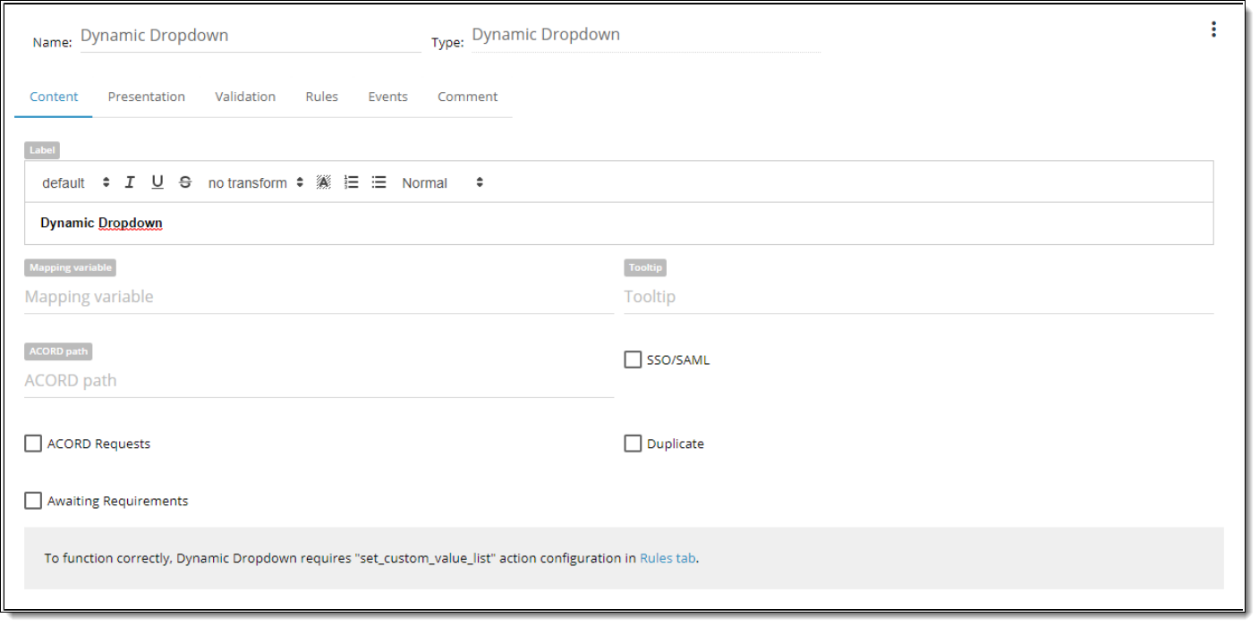
| Dynamic Dropdown – dropdown that can be populated by the values from other controls in real time. The values of this dropdown can be updated in real time as well. |
| Email – control that allows the user to enter an email for its verification and validation. |
| Grid – control that allows the user to add empty grid and configure it. |
| Hyperlink – control that allows the user to paste hyperlink. |
| IFrame – control that allows the user to insert external context. |
| Image – control that allows the user to add image control on the screen and choose image from the image library\or load image by URL. |
| Mask Control – provides restricted data input as well as formatted data output. This control supplies visual cues about the type of data being entered. |
| Numberbox – control that allows the user to get numeric only input from the use. |
| Radio Button – control that allows the user to set of mutually exclusive options. The user can select one radio button in a group. |
| SimpleText\Message – control that allows the user to add simple text on the screen that User won’t be able to edit. |
| Source Dropdown – dropdown that is populated by the value list from Custom Assembly |
| Source Grid – control that allows the user to add and configure grid that will be populated with pre-defined data from Custom Assembly and allows to use the data from that grid in other fields |
| Textbox – control that allows the user to get text only input from the user |
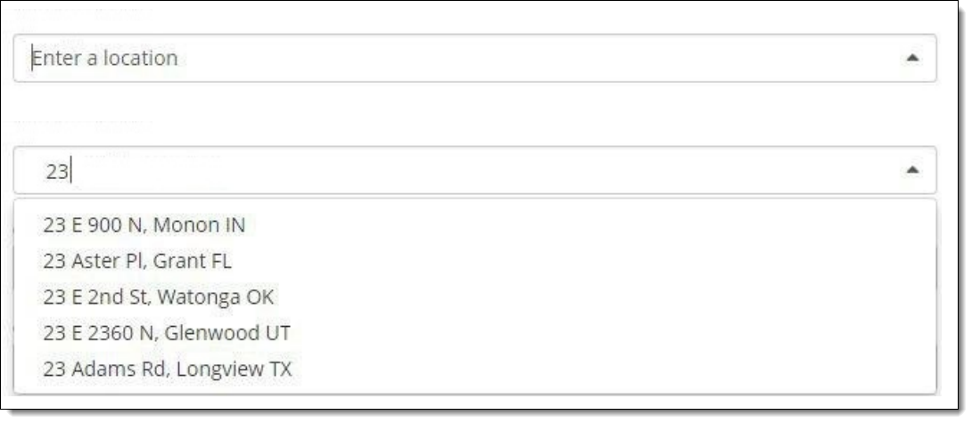
1. Address Lookup Control Properties
(previous name – Google Places Control) Works as a type-ahead search box. It provides an opportunity for an end user to search for addresses in the Smarty Streets library or Google Places library.
In the config file there is the key that indicates whether Disconnected Mode is ON or OFF
<Key Name=”DISCONNECTED_MODE”>TRUE</Key>.
When the Disconnected Mode is on (True) the system does not send requests to Smarty Streets or Google Places services. In this case the control works just like a text box and has to be populated manually.
Besides when the Disconnected Mode is ON action “Populate Address” does not work

| Property | Description |
| Label | the text that user will see above the control. Rich text editor provides an opportunity for the BA to format Label text as desirable |
| Mapping variable | is a property that allows the BA to type any value |
| Tooltip | text that user can see when he hovers over the control. |
| Default Value | default value that will be displayed in the Screen for the current control. |
| ACORD path | can be user-defined or populated by a Data Dictionary object |
| SSO/SAML | designate as an indicator if this value is passed in via silent login. |
| ACORD requests | designate status flag to determine whether include it in an XML submission that goes to customers when the application is completed. |
| Duplicate | is used by developers to develop serverside logic that determines whether when you “copy” or “duplicate” a case, whether or not to copy the individual data element that has been collected. Some of the controls are duplicated and others are not. |
| Awaiting Requirements | designate status flag to share with others to review current control. |

| Property | Description |
| Offset | Each component could have Offset property which vary from 1-12. O ffset allows to set space between controls on its left side. By default offset is set to “0” meaning the default space between all controls on the screen |
| Width | Each component could have width property which is defined in columns. WIDTH might vary from 1 to 12 (1/12 to 100% of screen width accordingly). |
| Placeholder | attribute specifies a short hint that describes the expected value of an input field. |
| Hide field | You can HIDE FIELD So user won’t see it on the screen. You can see the field in Rules. |
| Hide label | You can hide control Label so that user won’t see it on the screen |
| Disable by default | control will be disabled on the Screen. State could be changed by rule or event execution. |
| Property | Description |
| Is required | when it is checked – it is required to be filled in by the user. |
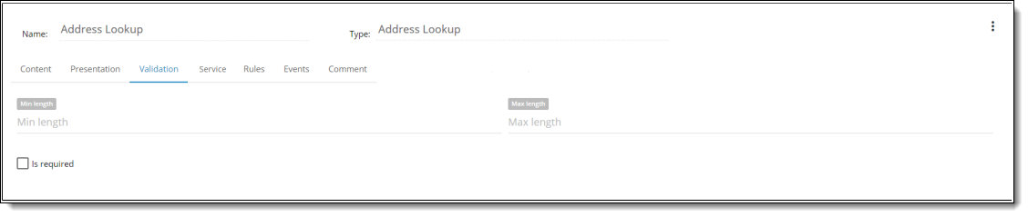
| Min length | sets minimum length for a control value. If the Google Places service returns a shorter value, then the system highlights the value with red color and screen becomes invalid. |
| Max length | sets maximum length for a control value. If the Google Places service returns a longer value, then the system does not truncate the value, instead it highlights the value with red color and screen becomes invalid. |

| Property | Description |
| Address search service | You can select which service to use to search for addresses. Smarty Streets library or Google Places library are available in the list. Selected service will provide the list of suggestions when searching for address in Runtime. |

Comments tab has a multi-line input for a BA to type his comment to the control. Comment is not displayed on Runtime and serves for internal analytical purposes.
2. Basic Dropdown Properties
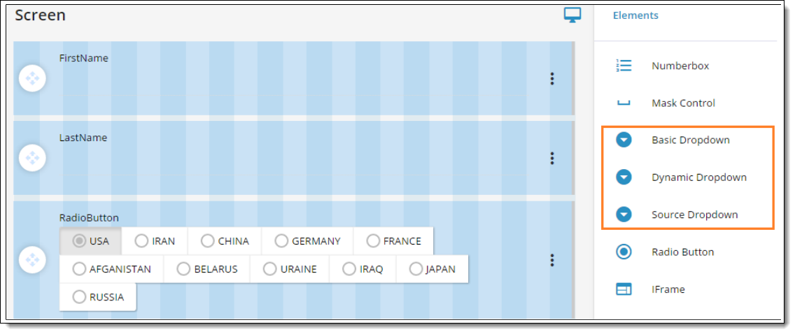
BA is able to select type of dropdown that will be added to the Screen:
- Basic Dropdown (standard value list from “list manager”)
- Dynamic Dropdown (configure action “Set Custom Value List”)
- Source Dropdown (3 party data source – configure custom assembly). Besides required “custom assembly name” field some rd
additional properties could be added at post MVP stage.
In case BA added Basic Dropdown for data source “Value list” is used. Action “Set Custom Value List” will be removed from Source dropdown,

| Property | Description |
| Name | is a required field. By this name you’ll be able to find control in the Rule. |
| Label | the text that user will see above the control. Rich text editor provides an opportunity for the BA to format Label text as desirable. |
| Mapping variable | is a property that allows the BA to type any value |
| Tooltip | text that user can see when he hovers over the control |
| Value list | provides values for the dropdown list. You can create your own value list. To do this you need to click the icon on the left from the Value List property. Ones you’ve created a new value list you can use it for any other control. |
| Default Value | default value that will be displayed in the Screen for the current control. |
| ACORD path | can be user-defined or populated by a Data Dictionary object. |
| SSO/SAML | designate as an indicator if this value is passed in via silent login. |
| ACORD REQUEST | designate status flag to determine whether include it in an XML submission that goes to customers when the application is completed. |
| DUPLICATE | is used by developers to develop serverside logic that determines whether when you “copy” or “duplicate” a case, whether or not to copy the individual data element that has been collected. Some of the controls are duplicated and others are not. |
| AWAITING REQUIREMENTS | designate status flag to share with others to review current control |

| Property | Description |
| Offset | Each component could have Offset property which vary from 1- 12. Offset allows to set space between controls on its left side. By default offset is set to “0” meaning the default space between all controls on the screen. |
| Width | Each component could have width property which is defined in columns. WIDTH might vary from 1 to 12 (1/12 to 100% of screen width accordingly). |
| Placeholder | Attribute specifies a short hint that describes the expected value of an input field. |
| Hide field | You can HIDE FIELD So user won’t see it on the screen. You can see the field in Rules. |
| Hide label | You can hide control Label so that user won’t see it on the screen. |
| Allow custom text | Possibility to type into the field and save a value that isn’t in the list (but that value won’t be added to the list of dropdown values). Typeahead (auto completion in the control) always works. |
| Is multiselect | Possibility to select many items from drop down.
NOTE: Dropdown is not closed until the User selects items that he needs and focuses out dropdown control. |
| Min character for lookup | Ability to define the min number of entered characters that triggers typeahead search inside dropdown. Default value is set to 1 character. |
| Disabled by default | Control will be disabled on the Screen. State could be changed by rule or event execution. |
| Use for type-ahead filtering | The property specifies what should be considered when type-ahead filtering is conducted. Set ‘Name’ to conduct type-ahead filtering based on Item Name; set ‘Value’ to conduct type-ahead filtering based on Item Value; use both ‘Name’ and ‘Value’ to conduct filtering based on both ‘Item’ and ‘Value’, in the first order the filtering is conducted based on what is set first. |

| Property | Description |
| Is required | when it is checked – it is required to be filled in by the user. |

exported Excel.

3. Button Control Properties
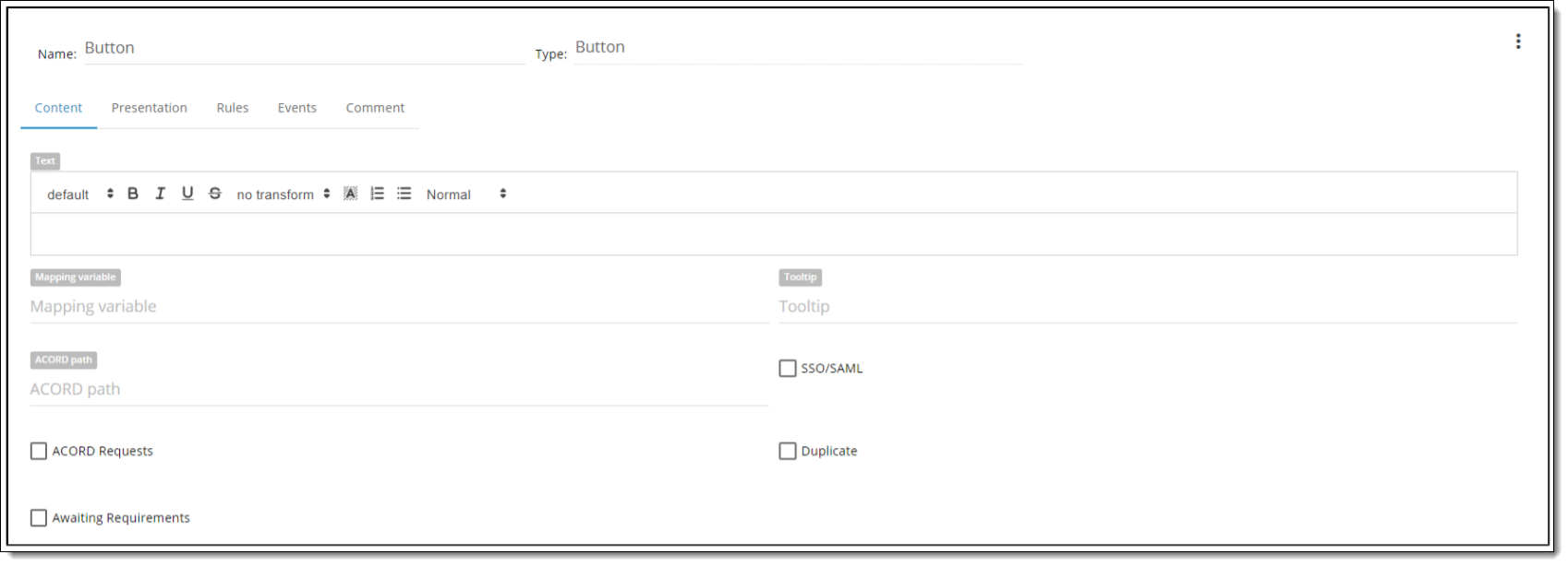
| Property | Description |
| Name | is a required field.By this name you’ll be able to find control in the Rule. |
| Type | defines a type of the control. |
| Text | is text that user will see near the control. |
| Tooltip | text that user can see when he hovers over the control. |
| Acord path | can be user-defined or populated by a Data Dictionary object. |
| Mapping Variable | is a textbox property that allows the BA to type any value. |
| SSO/SAML | designate as an indicator if this value is passed in via silent login. |
| Acord requests | designate status flag to determine whether include it in an XML submission that goes to customers when the application is completed. |
| Duplicate | is used by developers to develop serverside logic that determines whether when you “copy” or “duplicate” a case, whether or not to copy the individual data element that has been collected. Some of the controls are duplicated and others are not. |
| Awaiting Requirements | designate status flag to share with others to review current control. |
| Default Value | You can set default value Checked/Unchecked. |

| Property | Description |
| Offset | Each component could have Offset property which vary from 1-12. Offset allows setting space between controls on its left side. By default offset is set to “0” meaning the default space between all controls on the screen. |
| Width | Each component could have width property, which is defined in columns. WIDTH might vary from 1 to 12 (1/12 to 100% of screen width accordingly). |
| Hide Field/Label | You can HIDE FIELD So user will not see it on the screen or HIDE LABEL. You can show the field in the Rule. |
| Bootstrap Style | ability to set color to the button. |
| Disable by Default | control will be disabled on the Screen. State could be changed by rule or event execution. |

| Property | Description |
| Add New Rule | ability to create any number of rules. |
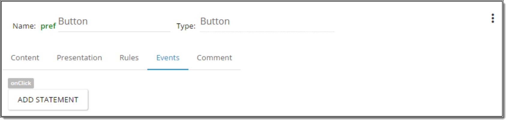
| Property | Description |
| Add Statement | ability to create any number of events that will be executed by clicking the button. |

| Property | Description |
| Comment | ability to add comments to the control. |
To allow end user to attach only one file per button, BA needs to perform the following steps:
1. Add Button control in Screen Designer. Set its name as, e.g. “Attach File”.

2. Open properties of added Button control and create onClick Event with upload_file action.

3. THIS IS IMPORTANT: Specify file name in “upload file with default name” field. e.g. “PDF1”
4. Click out of the Event and Close & Retain changes in Button control.
5. Go to Product root and click Variables tab.

6. Click “+” button and add a new variable with the name ATTACHMENT_ID_PDF1 (where PDF1 is your name that you specified in step 3 above) and type Textbox. Click Save.
7. Go to your Version, open the properties of the button that you added in step 1 above.
8. Create the Rule: IF Field Compare Value ATTACHMENT_ID_PDF1 is not empty THEN Disable Field <Attach File> ELSE Enable Field <button name>

9. After that when user attaches some file to that button in iGo -> the button will be disabled. When user deletes attached file from “All attachments” -> subject button will become enabled again.
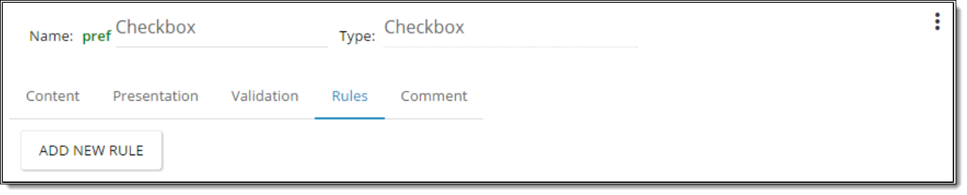
4. Checkbox Control Properties
| Property | Description |
| Name | is a required field.By this name you’ll be able to find control in the Rule. |
| Type | defines a type of the control. |
| Text | is text that user will see near the control. |
| Tooltip | text that user can see when he hovers over the control. |
| Default Value | You can set default value Checked/Unchecked. |
| Acord path | can be user-defined or populated by a Data Dictionary object. |
| Mapping Variable | is a textbox property that allows the BA to type any value. |
| SSO/SAML | designate as an indicator if this value is passed in via silent login. |
| Acord requests | designate status flag to determine whether include it in an XML submission that goes to customers when the application is completed. |
| Duplicate | is used by developers to develop serverside logic that determines whether when you “copy” or “duplicate” a case, whether or not to copy the individual data element that has been collected. Some of the controls are duplicated and others are not. |
| Awaiting Requirements | designate status flag to share with others to review current control. |

| Property | Description |
| Offset | Each component could have Offset property which vary from 1-12. Offset allows setting space between controls on its left side. By default offset is set to “0” meaning the default space between all controls on the screen. |
| Width | Each component could have width property, which is defined in columns. WIDTH might vary from 1 to 12 (1/12 to 100% of screen width accordingly). |
| Hide Field/Label | You can HIDE FIELD So user will not see it on the screen or HIDE LABEL. You can show the field in the Rule. |
| Disable by Default | control will be disabled on the Screen. State could be changed by rule or event execution. |

| Property | Description |
| Is Required | it is required to be filled n by the user |
| Property | Description |
| Add New Rule | ability to create any number of rules. |

| Property | Description |
| Comment | ability to add comments to the control. |
5. Date Control Properties

| Property | Description |
| Name | is a required field.By this name you’ll be able to find control in the Rule. |
| Type | defines a type of the control. |
| Label | is text that user will see above the control. |
| Tooltip | text that user can see when he hovers over the control. |
| Format | is a drop down property with predefined values: |
| List of predefined formats: | mm/dd/yy |
| mm/dd/yyyy | |
| mm/yy | |
| mm/yyyy | |
| yy | |
| yyyy | |
| dd/mm/yy | |
| dd/mm/yyyy | |
| Default Value | You can set default value Checked/Unchecked. |
| Acord path | can be user-defined or populated by a Data Dictionary object. |
| Mapping Variable | is a textbox property that allows the BA to type any value. |
| SSO/SAML | designate as an indicator if this value is passed in via silent login. |
| Acord requests | designate status flag to determine whether include it in an XML submission that goes to customers when the application is completed. |
| Duplicate | is used by developers to develop serverside logic that determines whether when you “copy” or “duplicate” a case, whether or not to copy the individual data element that has been collected. Some of the controls are duplicated and others are not. |
| Awaiting Requirements | designate status flag to share with others to review current control. |
For existing “Date control” localization is saved. Format defines via locale or via “Format” property in the property card.
If BA selects “Format” for date control then rendering type will be as “mask mode”. “Date Picker” will not be shown in Preview mode and
property “Hide date picker” will be hidden.
In Preview mode BA is able to see autogenerated tooltip. It could be removed by BA in the Property card.
If BA does NOT select “Format” for date control then rendering type will be as “date mode”.
If BA does NOT select “Format” for date control then rendering type will be as “date mode”. In Preview mode BA is able to enter the datemanually according to the format that BA sets. “Hide date picker” could be configured by BA.
Validation of Date input:
- correct value is saved.
- incorrect value is cleared out when BA clicks outside of (‘blurs’) the field.
When Format is not set and BA enters letters or symbols other than ‘/’ – date field is also cleared out when BA clicks outside of (‘blurs’) the
field.
NOTE:
- Restrictions are applied to the month (MM) and day (DD) only.
- Correct values: days from 1 to 31 (29 for February in leap years), months from 1 to 12
- When incorrect value is entered by some Rule it should be also validated and cleared out.

| Property | Description |
| Offset | Each component could have Offset property which vary from 1-12. Offset allows setting space between controls on its left side. By default offset is set to “0” meaning the default space between all controls on the screen. |
| Width | Each component could have width property, which is defined in columns. WIDTH might vary from 1 to 12 (1/12 to 100% of screen width accordingly). |
| Hide Field/Label | You can HIDE FIELD So user will not see it on the screen or HIDE LABEL. You can show the field in the Rule. |
| Disable by Default | control will be disabled on the Screen. State could be changed by rule or event execution. |
| Hide Date Picker | when is Unchecked – date picker for field is shown |

| Property | Description |
| Is Required | it is required to be filled n by the user |
| Property | Description |
| Add New Rule | ability to create any number of rules. |
| Property | Description |
| Add New Event | ability to create any number of events. |

| Property | Description |
| Comment | ability to add comments to the control. |
In feature switching tool (LaunchDarkly https://app.launchdarkly.com/) the User should be able to configure Rule for switching dates to ISO
format. This feature will help the Date control to do not depend on client time zone (when the User changes his time zone the entered value
will still remain).
By default: SD uses UNIX milliseconds timestamp.
- If Product ID is one of <ProductID_1>, <ProductID_2> is “True” then switching to ISO should be “ON”
- If Product ID is one of <ProductID_3>, <ProductID_4> is “False” Then switching to ISO should be “OFF”
By default: “True” (enabled)
- In case ISO feature switching is “ON” then in iGO only <DateName> value is changed.
Examples
PIDOB:”469602000000″
PIDOB_fmt:”11/18/1984″
PIDOB_iso:”1984-11-18″
PIDOB_val:”11/18/1984″
- In case ISO feature switching is “OFF” then date values are in UNIX milliseconds timestamp.


6. Dynamic Dropdown Control Properties
BA is able to select type of dropdown that will be added to the Screen:
- Basic Dropdown (standard value list from “list manager”)
- Dynamic Dropdown (configure action “Set Custom Value List”)
- Source Dropdown (3 party data source – configure custom assembly). Besides required “custom assembly name” field some rd
additional properties could be added at post MVP stage.

In case BA added Dynamic Dropdown for data source “Set Custom Value List” is used.
“Value list” DDL and “Default value” DDL are NOT displayed. Information message with a link to the Rules tab displays “To function correctly, Dynamic Dropdown requires “Set Custom Value List” action configuration in Rules tab.”
BA is able to add new Rule action “Set Custom Value List” and to select controls for displaying custom value list for selected drop down control. When “Set Custom Value List” action is executed -> DDL items are added from controls that gets populated with data. In case Rule action “Set Custom Value List” would not be configured -> DDL should be empty.
| Property | Description |
| Name | is a required field.By this name you’ll be able to find control in the Rule. |
| Type | defines a type of the control. |
| Mapping Variable | is a textbox property that allows the BA to type any value. |
| Tooltip | text that user can see when he hovers over the control. |
| Acord path | can be user-defined or populated by a Data Dictionary object. |
| SSO/SAML | designate as an indicator if this value is passed in via silent login. |
| Acord requests | designate status flag to determine whether include it in an XML submission that goes to customers when the application is completed. |
| Duplicate | is used by developers to develop serverside logic that determines whether when you “copy” or “duplicate” a case, whether or not to copy the individual data element that has been collected. Some of the controls are duplicated and others are not. |
| Awaiting Requirements | designate status flag to share with others to review current control. |

| Property | Description |
| Offset | Each component could have Offset property which vary from 1-12. Offset allows setting space between controls on its left side. By default offset is set to “0” meaning the default space between all controls on the screen. |
| Width | Each component could have width property, which is defined in columns. WIDTH might vary from 1 to 12 (1/12 to 100% of screen width accordingly). |
| Placeholder | attribute specifies a short hint that describes the expected value of an input field. |
| Hide Field | You can HIDE FIELD So user will not see it on the screen or HIDE LABEL. You can show the field in the Rule. |
| Hide Label | You can hide control Label so that user won’t see it on the screen. |
| Allow custom text | possibility to type into the field and save a value that isn’t in the list (but that value won’t be added to the list of dropdown values). Typeahead (auto completion in the control) always works. |
| Is multiselect | possibility to select many items from drop down.
NOTE: Dropdown is not closed until the User selects items that he needs and focuses out dropdown control. |
| Min Characters for lookup | ability to define the min number of entered characters that triggers typeahead search inside dropdown. Default value is set to 1 character. |
| Disable by Default | control will be disabled on the Screen. State could be changed by rule or event execution. |
| Use for type-head filtering | The property specifies what should be considered when type-ahead filtering is conducted. Set ‘Name’ to conduct type-ahead filtering based on Item Name; set ‘Value’ to conduct type-ahead filtering based on Item Value; use both ‘Name’ and ‘Value’ to conduct filtering based on both ‘Item’ and ‘Value’, in the first order the filtering is conducted based on what is set first. |

| Property | Description |
| Is Required | it is required to be filled n by the user |

| Property | Description |
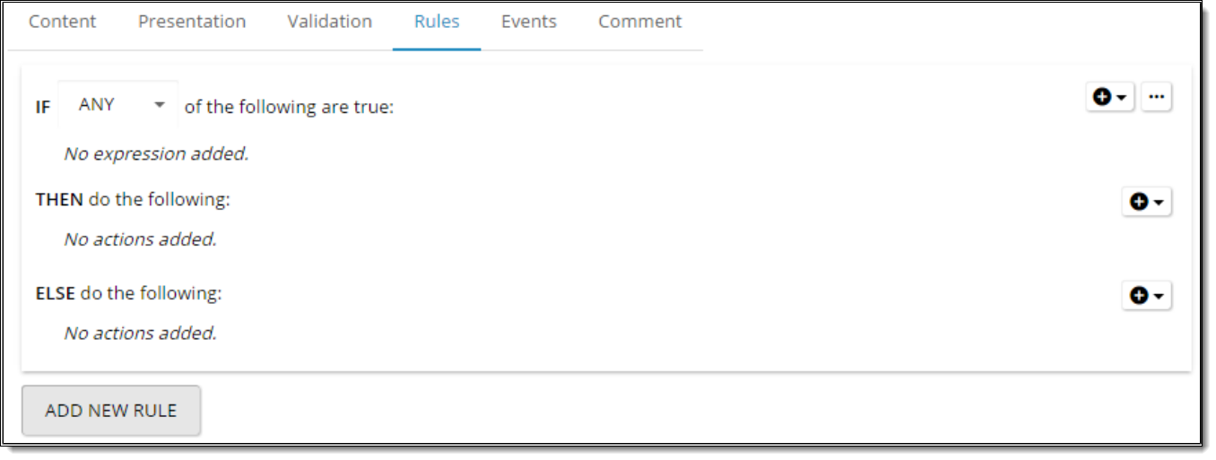
| Add New Rule | ability to create any number of rules. |

| Property | Description |
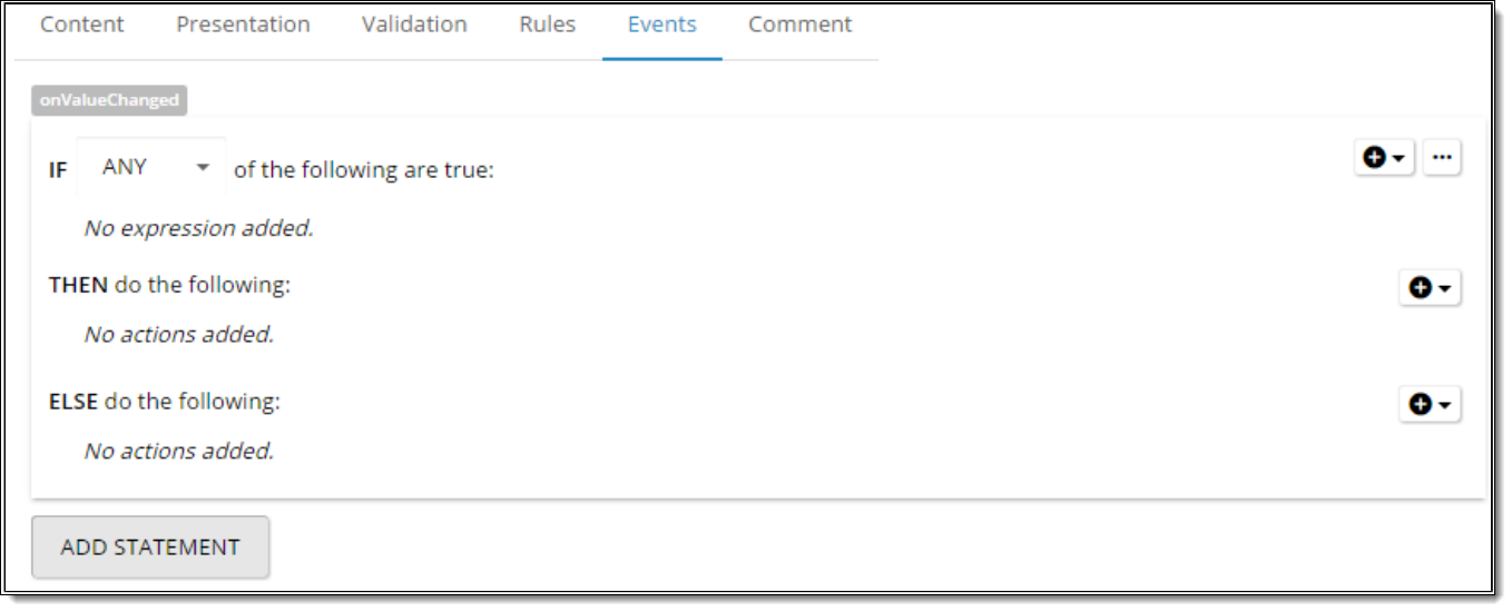
| Comment | ability to add comments to the control. |
7. Email Control Properties
Email Control is a control, which implements logic of email verification. Email entered into this control is passed to email verification service and validated against the rules of that service. This protects Suppliers from junk email addresses and fraudulent activities from the side of applicants.
In current implementation, the control allows to verify Email using KickBox service only. In later implementations support of other verification services can be added.
The Email control supports 3 types of verification results: Email is valid, Email is invalid, Server Error. The control shows appropriate message to end users for each verification result. Verify status doesn’t affect Screen status.
New Condition
New condition “Credit Card Is Valid” is implemented. Condition is used to check if selected credit card is valid. Available in Rule and Event sections.

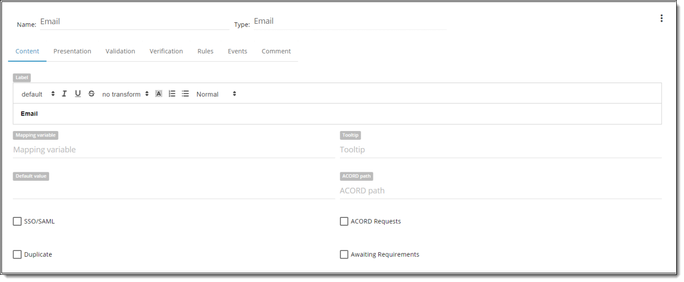
| Property | Description |
| Label | is text that user will see above the control. |
| Mapping Variable | is a textbox property that allows the BA to type any value. |
| Tooltip | text that user can see when he hovers over the control. |
| Default Value | You can set default value Checked/Unchecked. |
| Acord path | can be user-defined or populated by a Data Dictionary object. |
| SSO/SAML | designate as an indicator if this value is passed in via silent login. |
| Acord requests | designate status flag to determine whether include it in an XML submission that goes to customers when the application is completed. |
| Duplicate | is used by developers to develop serverside logic that determines whether when you “copy” or “duplicate” a case, whether or not to copy the individual data element that has been collected. Some of the controls are duplicated and others are not. |
| Awaiting Requirements | designate status flag to share with others to review current control. |
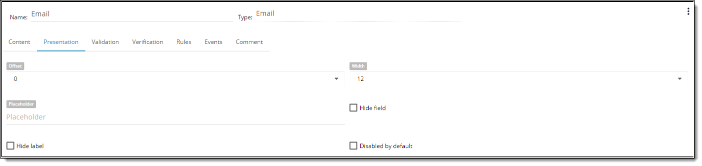
| Property | Description |
| Offset | Each component could have Offset property which vary from 1-12. Offset allows setting space between controls on its left side. By default offset is set to “0” meaning the default space between all controls on the screen. |
| Width | Each component could have width property, which is defined in columns. WIDTH might vary from 1 to 12 (1/12 to 100% of screen width accordingly). |
| Placeholder | attribute specifies a short hint that describes the expected value of an input field |
| Hide Field | You can HIDE FIELD So user will not see it on the screen or HIDE LABEL. You can show the field in the Rule. |
| Hide Label | You can hide control Label so that user won’t see it on the screen. |
| Disable by Default | control will be disabled on the Screen. State could be changed by rule or event execution. |
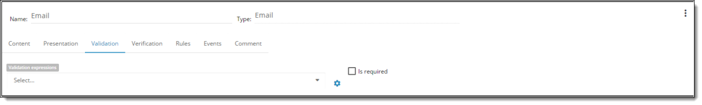
| Property | Description |
| Is Required | it is required to be filled n by the user |
| Min length | sets minimum length for a control value |
| Max Length | sets maximum length for a control value |
| Validation expressions | possibility to use regular expression and warnings if it does’t match |

| Block | Options | Values | Description |
| Verification service | verification service | No validation | A service used to verify CC Data. If validation service is not selected, the control doesn’t verify emails. |
| Kickbox | A service used to verify CC data. | ||
| Disconnected mode | In the config file there is the key that indicates whether Disconnected Mode is ON or OFF TRUE. <Key Name=”DISCONNECTED_MODE”.TRUE</Key>. When the Disconnected Mode is on (True) the system does not send requests to Verification service. In this case the control works just like a text box and has to be populated manually.
If disconnected mode is “on” at the moment a User clicks Verify button / focuses out of the control AND a verification service is selected for the control the system displays a message from the Error message text configuration parameter to an end user on runtime. Error message is shown in browser console (“server error: Cannot perform verification in disconnected mode”) and logs. |
||
| Trigger by | Trigger by | Button click | One of the verification check triggering modes, which launches Email verification on onClick event – when the User clicks a “Verify” button within an Email Control (Email should be correctly fulfilled and passed RegEx check). On button click system sends request for selected verification service (Kick box). |
| Blur | One of the verification check triggering modes, which launches Email verification on Blur event – when the User focuses out of Email Control (Email should be correctly fulfilled and passed RegEx check). System sends request for selected verification service (Kickbox). | ||
| Verify Email button name | Name of a Button within Email Control, which sends verification request to a verification service. The button is hidden in case “No validation” is selected in Verification service option. | ||
| Valid message text | Message text, which is displayed for the User in case an Email is verified and valid. | ||
| Invalid message text | Message text, which is displayed for an end user in case an Email is verified and invalid. | ||
| Error message text | Message text, which is displayed for an end user in case an Email was not verified due to error occured on Server or Client side. |
Troubleshooting
There are some situations, when the Email control is unable to verify entered Email due to errors in the config file:
- Kickbox URL is empty – this error occurs when <Key Name=”KICKBOX_URL”></Key>
- Error message “We are unable to validate your email his time. Please try again later.” can be returned in case <Key Name=”KICKBOX_URL”></Key> config key keeps incorrect URL or in case some other error occured on the server side.
In case you encounter some of the above errors – please, contact the support team.
8. Grid Control Properties
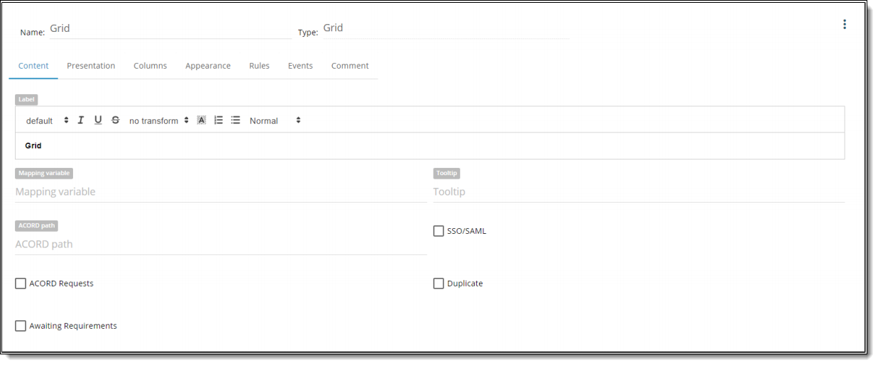
| Property | Description |
| Name | is a required field.By this name you’ll be able to find control in the Rule. |
| Type | defines a type of the control. |
| Label | is text that user will see above the control. |
| Tooltip | text that user can see when he hovers over the control. |
| Acord path | can be user-defined or populated by a Data Dictionary object. |
| Mapping Variable | is a textbox property that allows the BA to type any value. |
| SSO/SAML | designate as an indicator if this value is passed in via silent login. |
| Acord requests | designate status flag to determine whether include it in an XML submission that goes to customers when the application is completed. |
| Duplicate | is used by developers to develop serverside logic that determines whether when you “copy” or “duplicate” a case, whether or not to copy the individual data element that has been collected. Some of the controls are duplicated and others are not. |
| Awaiting Requirements | designate status flag to share with others to review current control. |

| Property | Description |
| Offset | Each component could have Offset property which vary from 1-12. Offset allows setting space between controls on its left side. By default offset is set to “0” meaning the default space between all controls on the screen. |
| Width | Each component could have width property, which is defined in columns. WIDTH might vary from 1 to 12 (1/12 to 100% of screen width accordingly). |
| Min Number of Rows to Fill | ability to configure min number of rows that required to fill out. Default value: 0. When this property is configured > 0 then BA will see message for min number of rows required to fill out ” required row(s) should be filled completely.” |
| Max Number of Rows | is limitation property for record creation. |
| Fill Mode | FULLY COMPLETE – in Detail View mode system gives “Save” if all currently displayed required fields are fulfilled. But returned to the Screen system invalidate it as optional fields are not fulfilled and fields that are required but were hidden in Detail view are not fulfilled as well |
| ONLY REQUIRED – grid works taking “min number of rows to fill”, “max number of rows to fill” properties into consideration. When the User selects “Only required” system considers only currently displayed in “Detail View” Grid edit mode required fields and makes Screen as valid. | |
| NOTE: At the moment for “Inline” Grid edit mode “Only required” property would not work. “Inline” Grid should be refactored. | |
| Hide Field | You can HIDE FIELD So user will not see it on the screen or HIDE LABEL. You can show the field in the Rule. |
| Hide Label | You can hide control Label so that user won’t see it on the screen. |
| Disable by Default | control will be disabled on the Screen. State could be changed by rule or event execution. |

| Property | Description |
| Show | ability to set which fields should be shown on the grid and which should be hidden |
| Column Name | Name of column = Label of the fields |
| Sortable | ability to sort column |
| Searchable | (not implemented) |
| Width, % | ability to set the size of the column in % |
| Order | ability to change the order of the columns in the grid |
If grid contains NO fields on it or in the property of the grid all columns are hidden – grid will be presented in one column view. If window was not configured for this grid -> BA will have informative message and has possibility to jump to the grid design.

In property card:


EDIT MODE:
INLINE – ability to fill in the grid cells via inline editing by clicking on the corresponding cell.

- If “Show Edit button for each row” is checked in the grid properties -> Grid Details Modal Window appears -> BA is able to edit grid row via
Grid Detail view. - Button “Add new record” should be disabled if the grid contains an empty row.

DETAIL VIEW – each new row in the grid has “Edit” button (pencil icon). Opens pop-up for editing row details -> Detail view window. When for grid is configured “Detail view” mode -> In Preview mode by clicking on “Add new record“ opens Detail View pop-up window.

- “Save” button is disabled until BA fills out inputs correctly. Invalid inputs highlights in yellow for required input and highlights in red in other
cases until BA fills out inputs correctly.
DISABLE – disable inline and pop-up editing grid cells.
SHOW BUTTON UNDER THE GRID FOR A NEW ROW TO BE ADDED BUTTON FOR EACH ROW – button should appear below the cells. By clicking on it new row will be added to the grid. By default: “Add new record. Text input should is editable and required.
SHOW DELETE BUTTON FOR EACH ROW – each new row in the grid has “Delete” button (trash icon). By clicking on it end user is able to delete a row from the grid.

| Property | Description |
| Name | is a required field.By this name you’ll be able to find control in the Rule. |
| Child Prefix | prefix that will be propagated to controls inside current Screen. |
| Type | defines a type of the control. |
| Label | is text that user will see above the control. |
| Awaiting Requirements | designate status flag to share with others to review current control. |
| Add New Rule | ability to create any number of rules. |
| Comment | ability to add comments to the control. |
If Detail View name is not defined in Design mode BA will see screen message “To start editing a Detail View please enter the name.” and control panel will be hidden. Adding of controls will be enabled only after Detail View name is filled. Similar behavior is applied for already existing GDVs with empty names and existing GDVs with empty names in Template.

9. Hyperlink Control Properties
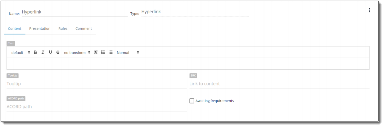
| Property | Description |
| Name | is a required field.By this name you’ll be able to find control in the Rule. |
| Type | defines a type of the control. |
| Text | is text that user will see near the control. |
| Tooltip | text that user can see when he hovers over the control. |
| SRC | You can set any URL to display it in Design and Preview modes. E.g. http://labs.invisionapp.com/craft By clicking this link in Preview mode BA will jump to it in a new tab of the browser. It is possible to use both absolute URLs (like www.google.com) and relative URLs (like ../../../variables). Relative ones depend on current iFrame URL. Enter ‘../’ to go up one level relative to current level. Enter ‘.. /filename’ to open file located up one level relative to current level. |
| Acord path | can be user-defined or populated by a Data Dictionary object. |
| Awaiting Requirements | designate status flag to share with others to review current control. |
| Property | Description |
| Offset | Each component could have Offset property which vary from 1-12. Offset allows setting space between controls on its left side. By default offset is set to “0” meaning the default space between all controls on the screen. |
| Width | Each component could have width property, which is defined in columns. WIDTH might vary from 1 to 12 (1/12 to 100% of screen width accordingly). |
| Hide Field/Label | You can HIDE FIELD So user will not see it on the screen or HIDE LABEL. You can show the field in the Rule. |
| Disable by Default | control will be disabled on the Screen. State could be changed by rule or event execution. |

| Property | Description |
| Add New Rule | ability to create any number of rules. |

| Property | Description |
| Comment | ability to add comments to the control. |
10. iFrame Control Properties

| Property | Description |
| Name | is a required field.By this name you’ll be able to find control in the Rule. |
| Type | defines a type of the control. |
| Label | is text that user will see above the control. |
| Tooltip | text that user can see when he hovers over the control. |
| SRC | You can set any URL to display it in Design and Preview modes. E.g. http://labs.invisionapp.com/craft By clicking this link in Preview mode BA will jump to it in a new tab of the browser. It is possible to use both absolute URLs (like www.google.com) and relative URLs (like ../../../variables). Relative ones depend on current iFrame URL. Enter ‘../’ to go up one level relative to current level. Enter ‘.. /filename’ to open file located up one level relative to current level. |
| Acord path | can be user-defined or populated by a Data Dictionary object. |
| Awaiting Requirements | designate status flag to share with others to review current control. |

| Property | Description |
| Offset | Each component could have Offset property which vary from 1-12. Offset allows setting space between controls on its left side. By default offset is set to “0” meaning the default space between all controls on the screen. |
| Width | Each component could have width property, which is defined in columns. WIDTH might vary from 1 to 12 (1/12 to 100% of screen width accordingly). |
| Hide Field/Label | You can HIDE FIELD So user will not see it on the screen or HIDE LABEL. You can show the field in the Rule. |
| Is Autoheight | |
| Fixed Content Height | is iFrame height in pixels |
| Property | Description |
| Add New Rule | ability to create any number of rules. |

| Property | Description |
| Comment | ability to add comments to the control. |
11. Image Control Properties

| Property | Description |
| Name | is a required field.By this name you’ll be able to find control in the Rule. |
| Type | defines a type of the control. |
| Label | is text that user will see above the control. |
| Tooltip | text that user can see when he hovers over the control. |
| SRC | You can set any URL to display it in Design and Preview modes. E.g. http://labs.invisionapp.com/craft By clicking this link in Preview mode BA will jump to it in a new tab of the browser. It is possible to use both absolute URLs (like www.google.com) and relative URLs (like ../../../variables). Relative ones depend on current iFrame URL. Enter ‘../’ to go up one level relative to current level. Enter ‘.. /filename’ to open file located up one level relative to current level. |
| Acord path | can be user-defined or populated by a Data Dictionary object. |
| Awaiting Requirements | designate status flag to share with others to review current control. |

| Property | Description |
| Add New Rule | ability to create any number of rules. |

| Property | Description |
| Comment | ability to add comments to the control. |
12. Mask Control Properties

| Property | Description |
| Name | is a required field.By this name you’ll be able to find control in the Rule. |
| Type | defines a type of the control. |
| Label | is text that user will see above the control. |
| Tooltip | text that user can see when he hovers over the control. |
| Acord path | can be user-defined or populated by a Data Dictionary object. |
| Mapping Variable | is a textbox property that allows the BA to type any value. |
| SSO/SAML | designate as an indicator if this value is passed in via silent login. |
| Acord requests | designate status flag to determine whether include it in an XML submission that goes to customers when the application is completed. |
| Duplicate | is used by developers to develop serverside logic that determines whether when you “copy” or “duplicate” a case, whether or not to copy the individual data element that has been collected. Some of the controls are duplicated and others are not. |
| Awaiting Requirements | designate status flag to share with others to review current control. |

| Property | Description |
| Offset | Each component could have Offset property which vary from 1-12. Offset allows setting space between controls on its left side. By default offset is set to “0” meaning the default space between all controls on the screen. |
| Width | Each component could have width property, which is defined in columns. WIDTH might vary from 1 to 12 (1/12 to 100% of screen width accordingly). |
| Mask | formatted data output (see “Mask values” example below) |
| MASKED CHARACTER – The field where BA is able to define what character to use for masking values with “Masked character” input. By default: Asterisk. Any character could be used. | |
| SHOW MASKED CHARACTERS IN PDF – By default: checked if “checked” –> the full value will be displayed in PDF form if “UNchecked” –> then field value with the masked characters will be mapped as seen on UI | |
| ENCRYPT – when it is checked, masked data will be encrypted before saving in the database. On UI it is always decrypted. | |
| Hide Field/Label | You can HIDE FIELD So user will not see it on the screen or HIDE LABEL. You can show the field in the Rule. |
| Disable by Default | control will be disabled on the Screen. State could be changed by rule or event execution. |
There is a handy tooltip inside property card when you hover on Mask field of Presentation tab:


| Property | Description |
| Validation Expressions | possibility to use regular expressions and warnings if it doesn’t match it |
| Is Required | it is required to be filled n by the user |
| Property | Description |
| Add New Rule | ability to create any number of rules. |

| Property | Description |
| Comment | ability to add comments to the control. |
13. Numberbox Control Properties

| Property | Description |
| Name | is a required field.By this name you’ll be able to find control in the Rule. |
| Type | defines a type of the control. |
| Label | is text that user will see above the control. |
| Mapping Variable | is a textbox property that allows the BA to type any value. |
| Tooltip | text that user can see when he hovers over the control. |
| Default Value | You can set default value Checked/Unchecked. |
| Acord path | can be user-defined or populated by a Data Dictionary object. |
| SSO/SAML | designate as an indicator if this value is passed in via silent login. |
| Acord requests | designate status flag to determine whether include it in an XML submission that goes to customers when the application is completed. |
| Duplicate | is used by developers to develop serverside logic that determines whether when you “copy” or “duplicate” a case, whether or not to copy the individual data element that has been collected. Some of the controls are duplicated and others are not. |
| Awaiting Requirements | designate status flag to share with others to review current control. |

| Property | Description |
| Offset | Each component could have Offset property which vary from 1-12. Offset allows setting space between controls on its left side. By default offset is set to “0” meaning the default space between all controls on the screen. |
| Width | Each component could have width property, which is defined in columns. WIDTH might vary from 1 to 12 (1/12 to 100% of screen width accordingly). |
| Placeholder | attribute specifies a short hint that describes the expected value of an input field |
| Format | possibility to configure numberbox format
|
| Decimal Digits | separates the whole number on the left from the decimal digits on the right |
| Hide Field/Label | You can HIDE FIELD So user will not see it on the screen or HIDE LABEL. You can show the field in the Rule. |
| Disable by Default | control will be disabled on the Screen. State could be changed by rule or event execution. |
| Prepend Label | to set a label before the number input |
| Append Label | to set a label after the number input |
| Property | Description |
| Min Value | sets minimum for a control value |
| Max Value | sets maximum for a control value |
| Validation Expressions | possibility to use regular expressions and warnings if it doesn’t match it |
| Is Required | it is required to be filled n by the user |
| Property | Description |
| Add New Rule | ability to create any number of rules. |

| Property | Description |
| Add New Event | ability to create any number of events. |

| Property | Description |
| Comment | ability to add comments to the control. |
14. RadioButton Control Properties

| Property | Description |
| Name | is a required field.By this name you’ll be able to find control in the Rule. |
| Type | defines a type of the control. |
| Label | is text that user will see above the control. |
| Mapping Variable | is a textbox property that allows the BA to type any value. |
| Tooltip | text that user can see when he hovers over the control. |
| Value List | You can create your own value list. To do this you need to click the icon on the left from the Value List property. Ones you’ ve created a new value list you can use it for any other control. |
| Default Value | You can set default value Checked/Unchecked. |
| Acord path | can be user-defined or populated by a Data Dictionary object. |
| SSO/SAML | designate as an indicator if this value is passed in via silent login. |
| Acord requests | designate status flag to determine whether include it in an XML submission that goes to customers when the application is completed. |
| Duplicate | is used by developers to develop serverside logic that determines whether when you “copy” or “duplicate” a case, whether or not to copy the individual data element that has been collected. Some of the controls are duplicated and others are not. |
| Awaiting Requirements | designate status flag to share with others to review current control. |
| Property | Description |
| Offset | Each component could have Offset property which vary from 1-12. Offset allows setting space between controls on its left side. By default offset is set to “0” meaning the default space between all controls on the screen. |
| Width | Each component could have width property, which is defined in columns. WIDTH might vary from 1 to 12 (1/12 to 100% of screen width accordingly). |
| Hide Field/Label | You can HIDE FIELD So user will not see it on the screen or HIDE LABEL. You can show the field in the Rule. |
| Is vertical | this property allows to change the representation view of the control.
|
| Disable by Default | control will be disabled on the Screen. State could be changed by rule or event execution. |

| Property | Description |
| Is Required | it is required to be filled n by the user |

| Property | Description |
| Add New Rule | ability to create any number of rules. |
| Property | Description |
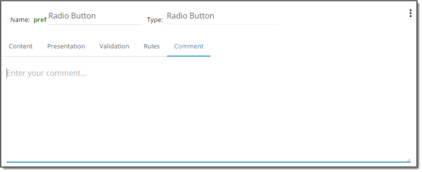
| Comment | ability to add comments to the control. |
15. SimpleText/Message Control Properties

| Property | Description |
| Name | is a required field.By this name you’ll be able to find control in the Rule. |
| Type | defines a type of the control. |
| Text | is text that user will see near the control. |
| Tooltip | text that user can see when he hovers over the control. |
| Acord path | can be user-defined or populated by a Data Dictionary object. |
| Awaiting Requirements | designate status flag to share with others to review current control. |
1. With introduction of Rich Editor functionality BA have a possibility to applly individual word formatting:
- to bold, underline, italicize, etc. certain parts of a simple text control with a static Label value.
- Example 1: The cow jumped over the moon.
- Example 2: I {PIFullName} will give all my money to the golden monkey on the corner.
- to display a simple text control in a bulleted list with a static Label value.
- to have line breaks in a simple text control with a static Label value.
2. List of controls that have rich editor toolbar in “Text” property:
- Simple Text\Message
- Checkbox
- Hyperlink
- Button
3. List of controls that have rich editor toolbar in “Label” property:
- Textbox
- Numberbox
- RadioButton
- DropDown(s)
- Mask
- IFrame
- Image
- Date
- Grid
- Signature
4. List of properties for Rich editor:
Font Size (H3 should be applied by default for “Label” property of Group control, but note that H3 of RTE is not equal to H3 of page
markup
- Bullets
- Numbering
- IsBold (should be enabled by default for “Label” property)
- IsItalicized
- IsMarked (“Background” property with color selection)
- IsSmall (lowercase)
- IsUnderlined
- Text Transform (Capitalize, UPPERCASE, lowercase)
- Text Color

| Property | Description |
| Offset | Each component could have Offset property which vary from 1-12. Offset allows setting space between controls on its left side. By default offset is set to “0” meaning the default space between all controls on the screen. |
| Width | Each component could have width property, which is defined in columns. WIDTH might vary from 1 to 12 (1/12 to 100% of screen width accordingly). |
| Hide Field/Label | You can HIDE FIELD So user will not see it on the screen or HIDE LABEL. You can show the field in the Rule. |
| Alert Style | ability to display simple text in alert style (success, info, warning, danger). By default “Alert style” is empty. “Alert style” property is displayed in action “change_text_style” |
| Text Color | ability to set color to text |
| Font Size | ability to format text size |
| Font Style | ability to format text style (bold, underlined etc). |
| Text Transform | ability to change text form (capitalize, uppercase, lowercase). |

| Property | Description |
| Add New Rule | ability to create any number of rules. |

| Property | Description |
| Comment | ability to add comments to the control. |

| Dynamic Text |
| Possible to insert in “Text” property dynamic text in format {control_name}.
BA is able to set text in the Simple Text\Message control and identify area which will change depending on the input to another Control OR a number of Controls. Dynamic Text is immediately changed according to the input from Controls. If related Control is empty or Control is Deleted – only text defined in the property of the Simple Text\Message control is displayed. NOTE: Insert {dynamic text} works for all controls in “Label” property. For controls that have NO label -> use in “Text” property (Button, Hyperlink, Checkbox). |

16. Source Dropdown Control Properties
BA is able to select type of dropdown that will be added to the Screen:
- Basic Dropdown (standard value list from “list manager”)
- Dynamic Dropdown (configure action “Set Custom Value List”)
- Source Dropdown (3rd party data source – configure custom assembly). Besides required “custom assembly name” field some additional properties could be added at post MVP stage.

In case BA added Source Dropdown for data source “Custom assembly” is used.
“Value list” DDL and “Default value” DDL are NOT displayed.
Custom assembly name input is displayed. BA is able to call for custom assembly so that logic implemented in the assembly is triggered by opening DDL -> DDL is populated with data -> the response of custom assembly is the list of values and values are displayed in DDL in Preview mode. Source Dropdown is also available in Controls panel for adding onto DetailView.
Action “Set Custom Value List” will be removed from Source dropdown, Basic dropdown (will be implemented soon).

| Property | Description |
| Name | is a required field.By this name you’ll be able to find control in the Rule. |
| Label | is text that user will see above the control. |
| Mapping Variable | is a textbox property that allows the BA to type any value. |
| Tooltip | text that user can see when he hovers over the control. |
| Acord path | can be user-defined or populated by a Data Dictionary object. |
| SSO/SAML | designate as an indicator if this value is passed in via silent login. |
| Acord requests | designate status flag to determine whether include it in an XML submission that goes to customers when the application is completed. |
| Duplicate | is used by developers to develop serverside logic that determines whether when you “copy” or “duplicate” a case, whether or not to copy the individual data element that has been collected. Some of the controls are duplicated and others are not. |
| Awaiting Requirements | designate status flag to share with others to review current control. |
| Custom Assembly Name | Allows user to define the Custom Assembly which the list with values will be populated from |

| Property | Description |
| Offset | Each component could have Offset property which vary from 1-12. Offset allows setting space between controls on its left side. By default offset is set to “0” meaning the default space between all controls on the screen. |
| Width | Each component could have width property, which is defined in columns. WIDTH might vary from 1 to 12 (1/12 to 100% of screen width accordingly). |
| Placeholder | attribute specifies a short hint that describes the expected value of an input field |
| Hide Field/Label | You can HIDE FIELD So user will not see it on the screen or HIDE LABEL. You can show the field in the Rule. |
| Allow custom text | possibility to type into the field and save a value that isn’t in the list (but that value won’t be added to the list of dropdown values). Typeahead (auto completion in the control) always works. |
| Is multiselect | possibility to select many items from drop down. NOTE: Dropdown is not closed until the User selects items that he needs and focuses out dropdown control. |
| Min Characters for lookup | ability to define the min number of entered characters that triggers typeahead search inside dropdown. Default value is set to 1 character. |
| Disable by Default | control will be disabled on the Screen. State could be changed by rule or event execution. |
| Use for type-ahead filtering | The property specifies what should be considered when type-ahead filtering is conducted. Set ‘Name’ to conduct type-ahead filtering based on Item Name; set ‘Value’ to conduct type-ahead filtering based on Item Value; use both ‘Name’ and ‘Value’ to conduct filtering based on both ‘Item’ and ‘Value’, in the first order the filtering is conducted based on what is set first. |

| Property | Description |
| Is Required | it is required to be filled n by the user |

| Property | Description |
| Add New Rule | ability to create any number of rules. |

| Property | Description |
| Add New Event | ability to create any number of events. |
exported Excel.

| Property | Description |
| Comment | ability to add comments to the control. |
17. Source Grid Control Properties
Source Grids are designed to load some pre-defined data in form of a table so that user could use the data from these Source Grids in other controls.
Auto-populated Source Grid could NOT be updated: user cannot edit, delete or add records.
To see the standard Grid Control Properties, click here.
Differences in Comparison with Grid Control
1. Appearance tab is removed.
2. Content and Presentation tabs, besides properties that has standard Grid, have the following differences:

“Content” tab has “Custom assembly name” required field and “Show Select column” checkbox (enabled by default).

“Presentation” tab has “Enable pagination” checkbox (more on that see below).
3. “Rules”, “Events”, “Comment” tabs should have the same properties as standard Grid. Click here to see their properties.
4. Due to Source Grid do NOT have Detail View, columns configuration is supported only inside the “Columns” tab of the property card:

- Users can add columns inside “Columns” tab via “ADD NEW COLUMN” button

- Standard “Show” check box, “Width, %” and “Order” properties are present
- “Column type” field is added (required field). User is able to add the following control types: Textbox, Checkbox, Numberbox, Date, Mask Control. Control type is saved after clicking on “Close&retain changes” in Source Grid property card.
- “Column name” field is added (required field). Column name is saved after clicking on “Close&retain changes” in Source Grid property
card. - “Column title” field is added (optional field). Column title is saved after clicking on “Close&retain changes” in Source Grid property card.
- When “Column title” is empty and user enters “Column name”, the value from “Column name” is propagated to “Column title” on blur.
- When “Column title” is empty in property card, it remains empty at runtime.
- Column could be removed via “minus” icon. When “minus” icon is clicked corresponding column is removed from UI. Changes are saved after clicking on “Close&retain changes” in Source Grid property card.
- User can configure properties of added columns by clicking “ellipsis” button next to appropriate column. Only Numberbox, Date and Mask column types have additional properties that could be accessed by clicking “ellipsis” button. Changes are saved after clicking on “Close&retain changes” in Source Grid property card.
5. BA should set up Event action “Load Grid Data” inside other control in order to trigger the population of created Source Grid with the data from Custom assembly, that is defined on the “Content” Tab of the Property card or called via “Call Service”/ “Call JS Service”. Without that step the created Source Grid will remain empty.
6. BA can optionally set up Event action “Clear Grid Data” so that the data of created Source Grid will be cleared.
7. BA can add actions in Events tab of the Source Grid, that will be triggered by onSelect and onUnselect events. For example BA can add onSelect Event with “Copy Grid Value” action so that it will copy the value from selected row to other field outside of the Source Grid.
- Note that “Show Select column” checkbox should be enabled (refer to point 2 above) so that user could select (and unselect) rows in Source Grid.

Notes:
- If user triggers again the event to populate the grid, previously selected rows are reset.
- The data from “checked” rows is saved in Client Data

- When “Enable pagination” checkbox in Presentation tab is in enabled state, user will see pagination controls below the corresponding Source Grid at runtime.
- User can set amount of rows visible on one page (available values: 5, 10, 25, 50, all; by default it is set to 10).
- In case when Custom Assembly returns less rows than it is specified in “Showing 1 to …” dropdown, user will see only available rows, without empty ones.

Source Grid can be added to regular Grid control at Grid Details screen so that end user could copy values from Source Grid to regular Grid or could use info from Source Grid as reference.
To set up copying of values from Source Grid to regular Grid BA should perform the following steps:
- Add Grid
- Add columns in Grid and configure them. Note that you should know in advance what types of columns contains Source Grid that you will add later and what info you want to copy from that Source Grid to the columns you are adding.
- Add button in Grid.
- Add and configure Source Grid: refer to points 4-6 in “Differences in comparison with Grid control” section above.
- Configure button added before so that it could trigger copying of data from Source Grid to columns of regular Grid.

- At the end BA would get something like that:

- As a result, in runtime, when end user clicks “Copy value from Source Grid to Grid” values that are displayed in selected row will be copied to corresponding fields of regular Grid.
18. Textbox Control Properties
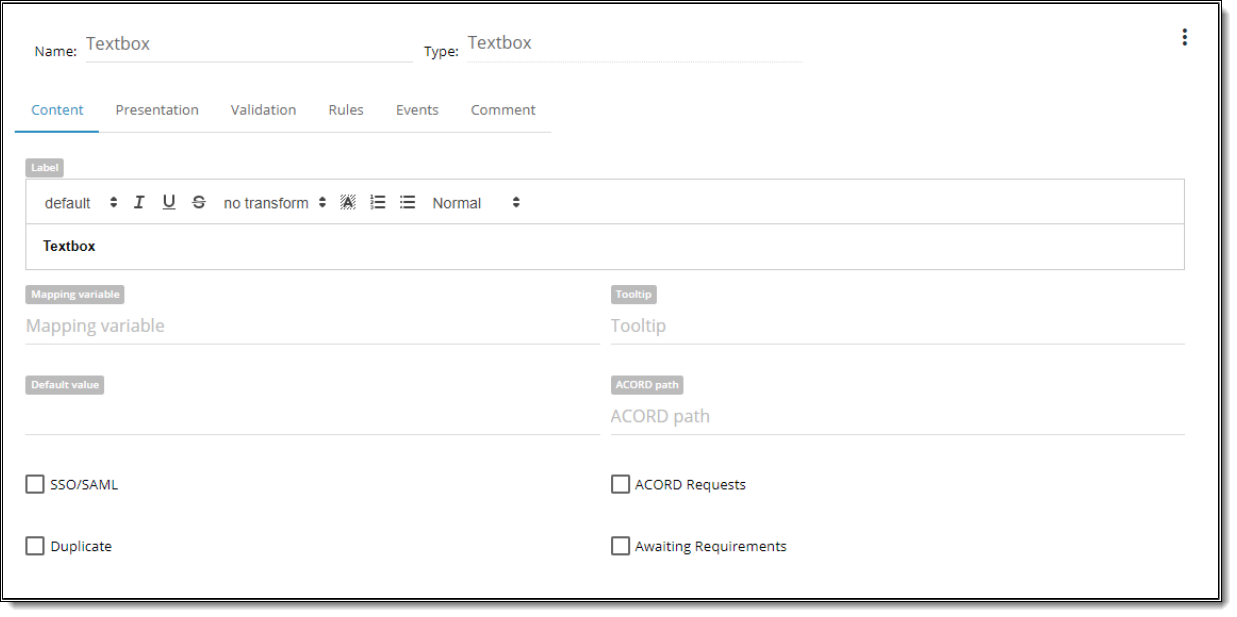
| Property | Description |
| Name | is a required field.By this name you’ll be able to find control in the Rule. |
| Type | defines a type of the control. |
| Label | is text that user will see above the control. |
| Mapping Variable | is a textbox property that allows the BA to type any value. |
| Tooltip | text that user can see when he hovers over the control. |
| Default Value | You can set default value Checked/Unchecked. |
| Acord path | can be user-defined or populated by a Data Dictionary object. |
| SSO/SAML | designate as an indicator if this value is passed in via silent login. |
| Acord requests | designate status flag to determine whether include it in an XML submission that goes to customers when the application is completed. |
| Duplicate | is used by developers to develop serverside logic that determines whether when you “copy” or “duplicate” a case, whether or not to copy the individual data element that has been collected. Some of the controls are duplicated and others are not. |
| Awaiting Requirements | designate status flag to share with others to review current control. |

| Property | Description |
| Offset | Each component could have Offset property which vary from 1-12. Offset allows setting space between controls on its left side. By default offset is set to “0” meaning the default space between all controls on the screen. |
| Width | Each component could have width property, which is defined in columns. WIDTH might vary from 1 to 12 (1/12 to 100% of screen width accordingly). |
| Placeholder | attribute specifies a short hint that describes the expected value of an input field |
| Hide Field/Label | You can HIDE FIELD So user will not see it on the screen or HIDE LABEL. You can show the field in the Rule. |
| Multiline | possibility to multiline entry |
| Text Area Rows | attribute specifies how many rows will be displayed by default |
| Disable by Default | control will be disabled on the Screen. State could be changed by rule or event execution. |
| Prepend Label | to set a label before the text input |
| Append Label | to set a label after the text input |

| Property | Description |
| Min Length | the minimum number of symbols user can type into the field |
| Max Length | the maximum number of symbols user can type into the field |
| Validation Expressions | possibility to use regular expressions and warnings if it doesn’t match it |
| Is Required | it is required to be filled n by the user |

| Property | Description |
| Add New Rule | ability to create any number of rules. |

| Property | Description |
| Add New Event | ability to create any number of events. |

| Property | Description |
| Comment | ability to add comments to the control. |
This content is restricted to registered users. iPipeline customers can login or register below. Please allow up to 24 hours for your account to be approved.