Overview
Maestro controls are accommodated into two groups: Basic and Complex Controls. Below is a list and description of the Complex Controls available in the Screen Designer.
Complex Controls
Click on an item below for more information
| AIS (Allfinanz Interview Server) | control that displays iFrame where integrated AIS form is displayed. AIS (Allfinanz Interview Server) form is a questionnaire that has to be populated by client.
|
| Credit Card | control that allows the user to enter credit card data for its further processing by FTNI. |
| Paramed | control that allows to schedule medical examination right in the process of case completion. Three services are available for scheduling of medical examination: ExamOne, EMSI, APPS. |
| Signature | control that allows the user to sign with fingers on the touch screen device. |
| Signature iFrame | control that shows third party Vendor’s content of the Signature process. |
1. AIS (Allfinanz Interview Server) Control Properties
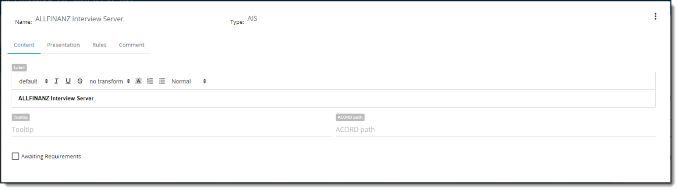
| Property | Description |
| Name | is a required field. By this name you’ll be able to find control in the Rule. |
| Type | defines a type of the control |
| Label | is the text that a user will see near the control |
| Tooltip | the text that a user can see when he hovers over the control. |
| ACORD path | can be user-defined or populated by a Data Dictionary object |
| Awaiting Requirements | designate the status flag to share with others to review the current control. |

| Property | Description |
| Offset | Each component has Offset property which varies from 1 to 12. Offset allows to set space between controls on the left side. By default offset is set to “0” meaning the default space between all controls on the screen |
| Width | Each component has width property, which is defined in columns. WIDTH varies from 1 to 12 (1/12 to 100% of screen width accordingly). |
| Hide Field/Label | You can HIDE FIELD So the user will not see it on the screen or HIDE LABEL. You can show the field in the Rule. |
| Is Autoheight | |
| Fixed Content Height | is the form height in pixels |

| Property | Description |
| Add New Rule | ability to create any number of rules. |

| Property | Description |
| Comment | ability to add comments to the control. |
2. Credit Card Control Properties
Credit Card control represents a group of input fields to enter Credit Card (hereinafter CC) information. The control implements logic of CC data verification, which checks whether the entered CC data is valid or not.
The control uses SD Service API to integrate with third-party CC verification services. In current implementation, the control allows to verify CC information using FTNI gateway only. In later implementations support of other verification services can be added.
The CC control supports 3 types of verification results: CC data is valid, CC data is invalid, Server Error. The control shows appropriate message to end users for each verification result. Verify status doesn’t affect Screen status.
In “Populate Field” displays dropdown field with available credit card controls. In “from” dropdown field BA would able to select controls from which value will be copied into credit card inputs.


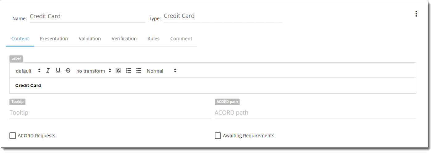
| Property | Description |
| Label | is the text that a user will see near the control |
| Mapping Variable | is a property that allows the BA to type any value |
| Tooltip | the text that a user can see when he hovers over the control. |
| ACORD path | can be user-defined or populated by a Data Dictionary object |
| ACORD requests | designate status flag to determine whether include it in an XML submission that goes to customers when the application is completed. |
| Awaiting Requirements | designate the status flag to share with others to review the current control. |

| Property | Description |
| Offset | Each component has Offset property which varies from 1 to 12. Offset allows to set space between controls on the left side. By default offset is set to “0” meaning the default space between all controls on the screen |
| Width | Each component has width property, which is defined in columns. WIDTH varies from 1 to 12 (1/12 to 100% of screen width accordingly). |
| Hide Field/Label | You can HIDE FIELD So the user will not see it on the screen or HIDE LABEL. You can show the field in the Rule. |
| Disable by default | control will be disabled on the Screen. State could be changed by rule or event execution. |
| Show Fields | A group of options to configure what fields to display in CC Control on Runtime (mind that if you hide input then it will send empty value). These are:
NOTE: In case you hide “Card number”, “Cardholder name”, “Expiration date” via Presentation tab the end-user will not be able to fill these fields and the system will send empty value and verification process will return us an ERROR message. In case you hide “CVV” the request still will pass as its not a required field for FTNI service. |
| Show billing statement address fields | A group of options to configure what supplementary fields to display in CC Control on Runtime. These are:
|
| Premium amount | Premium amount is amount the SD system sends to credit card verification service to verify credit card information. When Premium amount option is on, Premium amount field is displayed on Runtime for an end User. By default, the option is disabled, which means the field is not displayed for an end User.
Premium amount field is a required field, which accepts numericals with 2 decimal places. Disabled by default. Keep in mind that by default amount is specified in US dollars. |
| Block | Options | Values | Description |
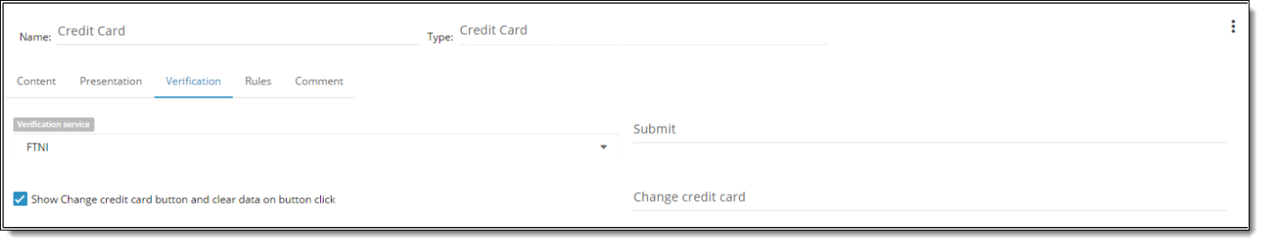
| Verification service | Verification service | FTNI | A service used to verify CC Data |
| Verification service | Disconnected Mode | In the config file there is the key that indicates whether Disconnected Mode is ON or OFF TRUE <Key Name=”DISCONNECTED_MODE”>TRUE< /Key>. When the Disconnected Mode is on (True) the system does not send requests to Verification service. In this case the control works just like a text box and has to be populated manually.
If disconnected mode is “on” at the moment a User clicks Verify button / focuses out of the control AND a verification service is selected for the control the system displays a message from the Error message text configuration parameter to an end user on runtime. Error message is shown in browser console (“server error: Cannot perform verification in disconnected mode”) and logs. Note: Nevertheless “Populate Credit Card” action will work as this doesn’t require internet connection. |
|
| Trigger value on | Trigger value on | Button Click | One of the verification check triggering modes, which launches CC verification on onClick event – when the User clicks a “Submit” button within a CC Control. |
| Submit button name | Name of a Button within CC Control, which sends verification request to a verification service.
After successful verification response is received:
After failure verification response is received:
After error verification response is received:
|
||
| Change Date | Show change credit card button and clear data on button click | True/False | An option, which shows/hides “Change Credit Card” button. When the User checks “Show Change credit card button and clear data on button click” check box Change credit card button displays required type textbox input for entering Change credit card button name that will be displayed in Preview mode.
Only after the “Submit” button to verify the credit card button was selected and verification process was triggered-> the data was verified and valid -> “Change credit card” would be displayed and “Submit” button would be hidden. By clicking on “Change credit card” button system clears entered data and provides an opportunity to “reenter” data. |
| Change credit card button name | Name of a Button within CC Control, which enables to clear up information of a verified credit card and enter information of a new credit card into the CC Control. |

| Block | Options | Values | Description |
| Accepted Card Types | Select a single or multiple accepted card type | Check/Uncheck | BA can select which type of cards to accept in the Credit Card control. Only checked types of cards will pass verification.
List of accepted Credit cards:
By default: All Credit card types are checked. |
| Default Status | Select default status to be passed to FTNI |
|
BA can select which status to pass to FTNI from the ‘Default Status’ dropdown.
These statuses are supported by FTNI service. Once BA has assigned the default status to the credit card the request sent to FTNI should be provided with the selected status. The ‘Hold’ value should be set as the default value of the property. |
| DoNotUpdateCustomer | DoNotUpdateCustomer | True/False | Set to true to not update the EpayCustomer name and address with information provided with the payment. This change will only occur if the information provided does not match the information in the customer record.
If false and the name and address in the transaction is different than what is on the EpayCustomer, the EpayCustomer will be updated. The default is false. |
| DoNotUseCustomerName | DoNotUseCustomerName | True/False | Set to true to use the name provided with the transaction on the payment method.
If set to false the EpayCustomer name will be used as the payer name for the payment method. The default is false. |
| DoNotUseCustomerAddress | DoNotUseCustomerAddress | True/False | Set to true to use the address provided with the transaction on the payment method.
If set to false the EpayCustomer address will be used as the payer address for the payment method. The default is false. |
There are some situations, when the CC control is unable to verify CC information due to errors in the config file:
- FTNI URL is empty. – this error occurs, when <Key Name=”FTNI_URL”></Key> parameter has no value.
- FTNI response is null. – error is returned to the SD in case an SD Sevice received empty responce. Such error can occur in case <Key Name=”FTNI_URL”></Key> parameter has incorrect URL
- FTNI credentials are empty. – this error occurs, when some of the following keys has no value or both of them are empty: <Key Name=”FTNI_USER_NAME”></Key>, <Key Name=”FTNI_USER_PASSWORD”></Key>
- “message”: “Internal Server Error” can return from the esb service in case credentials to access a verification service are invalid in config: <Key Name=”FTNI_USER_NAME”></Key>, <Key Name=”FTNI_USER_PASSWORD”></Key>
In case you encounter some of the above errors – please, contact the support team.
3. Paramed Control Properties
Paramed Control allows an end user to schedule medical examination using one of three available services: ExamOne, EMSI, APPS.
It consist of: dropdown with the list of available Paramed services and ‘Schedule an Appointment’ button.

Once service is selected button becomes active. Clicking on the ‘Schedule an Appointment’ button will trigger opening of selected service in the New Window.

If Browser blocks opening of the corresponding service in the new window then:
- Message will be displayed: “Oops! It looks like your browser is blocking pop-ups. Click the button below to go directly to the Scheduling Service page.”
- ‘Go To Scheduler’ button will be displayed instead of ‘Schedule an Appointment’ button.
Clicking on the ‘Go To Scheduler’ button will open selected service in the New Window.
NOTE:
- When scheduling service is opened in the new window and you navigate to another iGO screen without submitting scheduling you will need to save any entered data in the fields on other screens. Otherwise, all entered but not saved data on that screens will be cleared once you submits the scheduling.
- When getting the error status to start scheduling again you need:
- Leave and move back to the Paramed page (error status will be cleared when you select vendor from the dropdown).
- Refresh the page

| Property | Description |
| Label | is the text that a user will see near the control |
| Tooltip | the text that a user can see when he hovers over the control. |
| ACORD path | can be user-defined or populated by a Data Dictionary object |
| Awaiting Requirements | designate the status flag to share with others to review the current control. |
| Allowed paramed services | user can define the list of Paramed services that will be available for the end users in Runtime. |

| Property | Description |
| Offset | Each component has Offset property which varies from 1 to 12. Offset allows to set space between controls on the left side. By default offset is set to “0” meaning the default space between all controls on the screen |
| Width | Each component has width property, which is defined in columns. WIDTH varies from 1 to 12 (1/12 to 100% of screen width accordingly). |
| Hide Field/Label | You can HIDE FIELD So the user will not see it on the screen or HIDE LABEL. You can show the field in the Rule. |
| Button Text | the text that will be displayed as a button label |

| Property | Description |
| Is required | When it is checked – it is required to be filled in by the user. It will be highlighted in iGO with yellow color and screen will not be validated until required field is filled in. Checked by default for Paramed control. |

| Property | Description |
| Add New Rule | ability to create any number of rules. |

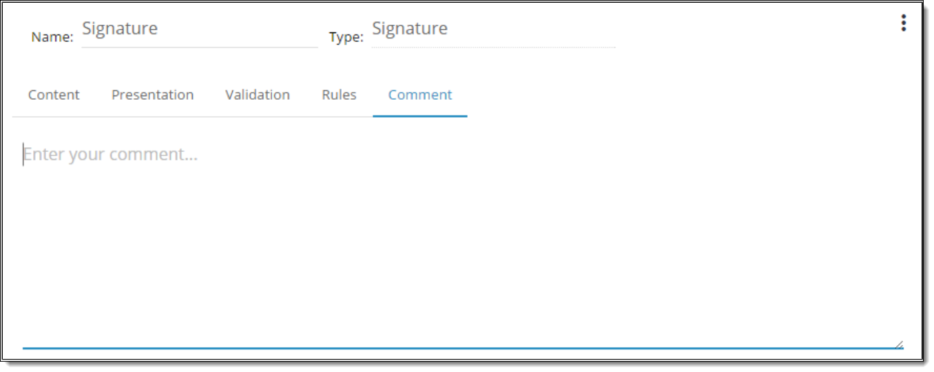
Comments tab has a multiline input for a BA to type his comment to the control. Comment is not displayed on Runtime and serves for internal analytical purposes.
| Property | Description |
| Comment | ability to add comments to the control. |
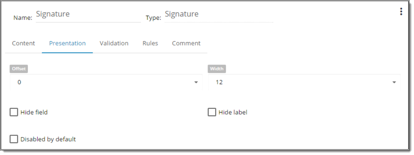
4. Signature Control Properties

| Property | Description |
| Name | is a required field.By this name you’ll be able to find control in the Rule. |
| Type | defines a type of the control |
| Label | is text that user will see above the control. |
| Tooltip | text that user can see when he hovers over the control. |
| ACORD path | can be user-defined or populated by a Data Dictionary object. |
| ACORD requests | designate status flag to determine whether include it in an XML submission that goes to customers when the application is completed. |
| Awaiting requirements | designate status flag to share with others to review current control. |
# Standard default is to set the signature line *width* as 2 pixels wide.
# Standard default is to set the signature line *color* as black #000000.
| Property | Description |
| Offset | Each component could have Offset property which vary from 1-12. Offset allows setting space between controls on its left side. By default offset is set to “0” meaning the default space between all controls on the screen. |
| Width | Each component could have width property, which is defined in columns. WIDTH might vary from 1 to 12 (1/12 to 100% of screen width accordingly). |
| Hide Field/Label | You can HIDE FIELD So user will not see it on the screen or HIDE LABEL. You can show the field in the Rule. |
| Disabled by Default | control will be disabled on the Screen. State could be changed by rule or event execution |

| Property | Description |
| Is Required | when it is checked – it is required to be filled in by the user |

| Property | Description |
| Add New Rule | ability to create any number of rules. |
| Property | Description |
| Comment | ability to add comments to the control. |
1. The “Signature” control initially displays:
- enabled “Sign” button
- disabled “Clear” button
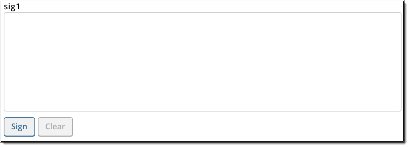
2. After clicking “Sign” button for the first time:
- enabled “Capture” button
- enabled “Clear” button

3. BA is able to clear the contents of the signature area after the user signs via “Clear” button. Once BA starts to sign “Undo last stroke” button is displayed. It’s possible to undo the last stroke if multiple strokes are used for the signature via button click “Undo last stroke”.
Once “Capture” button is clicked the signature is saved as a png encoded image in the database. And should revert back to the original view so BA can redo the signature process if needed.

5. Signature iFrame Control Properties
The Signature iFrame is designed specifically for eSig process products.
Signature iFrame serves the following purposes:
- request Signature vendor’s URL
- display Signature vendor’s web-page
- observe signing status
- put request statuses to appropriate Custom Variables
At RunTime the control shows Vendor’s content inside it to fulfill electronic signature tasks.


| Property | Description |
| Name | is a required field.By this name you’ll be able to find control in the Rule. |
| Type | defines a type of the control |
| Label | is text that user will see above the control. |
| Tooltip | text that user can see when he hovers over the control. |
| ACORD path | can be user-defined or populated by a Data Dictionary object. |
| Awaiting requirements | designate status flag to share with others to review current control. |
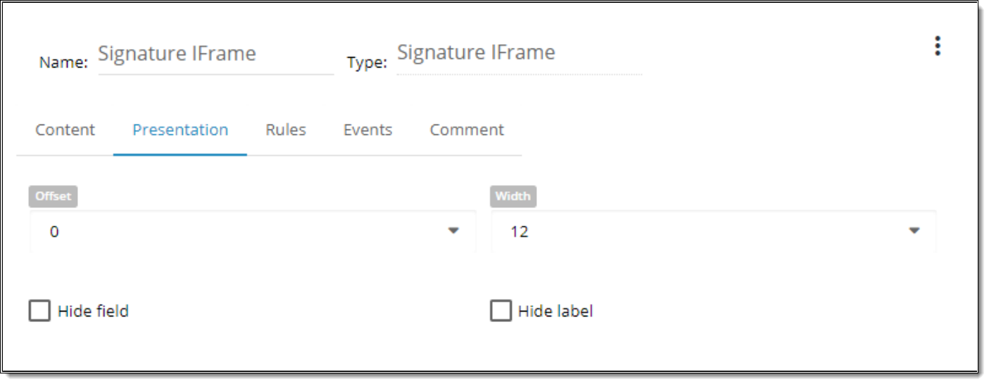
| Property | Description |
| Offset | Each component could have Offset property which vary from 1-12. Offset allows setting space between controls on its left side. By default offset is set to “0” meaning the default space between all controls on the screen. |
| Width | Each component could have width property, which is defined in columns. WIDTH might vary from 1 to 12 (1/12 to 100% of screen width accordingly). |
| Hide Field/Label | You can HIDE FIELD So user will not see it on the screen or HIDE LABEL. You can show the field in the Rule. |

Comment tab has a multiline input for a BA to type his comment to the control. Comment is not displayed on Runtime and serves for internal analytical purposes.
| Property | Description |
| Comment | ability to add comments to the control. |
This content is restricted to registered users. iPipeline customers can login or register below. Please allow up to 24 hours for your account to be approved.