Overview
Issues with how page widths display in Forms can be easily corrected by following the steps below.
Resolution Steps
Instruct your website administrator to do one of the following:
1. Remove the iFrame and open Forms in a new window or tab. This allows Forms to display the best possible user interface for your users (recommended solution).
Example HTML code:
<a href=”https://formspipe.ipipeline.com/” target=”_blank”>Click here for Forms</a>
2. Increase the width of the iFrame within your website so that Forms has the maximum amount of space available. This allows Forms to use the Medium or Large device user interface for the best customer experience.
Example HTML code:
<iframe src=”https://formspipe.ipipeline.com” width=”100%” ></iframe>
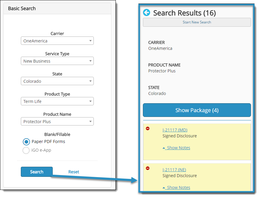
User Interface Device Sizes
Below are examples of what the Forms user interface will look like depending on the resolution of the device.
Large Devices
Desktops/Laptops (>1200px)
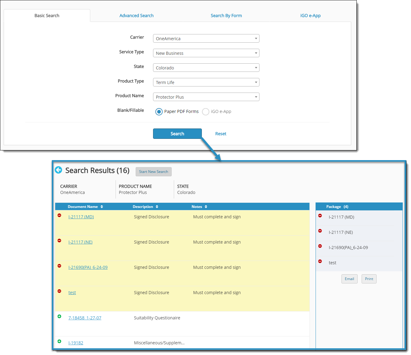
Medium Devices
Desktops/Laptops (>992px)
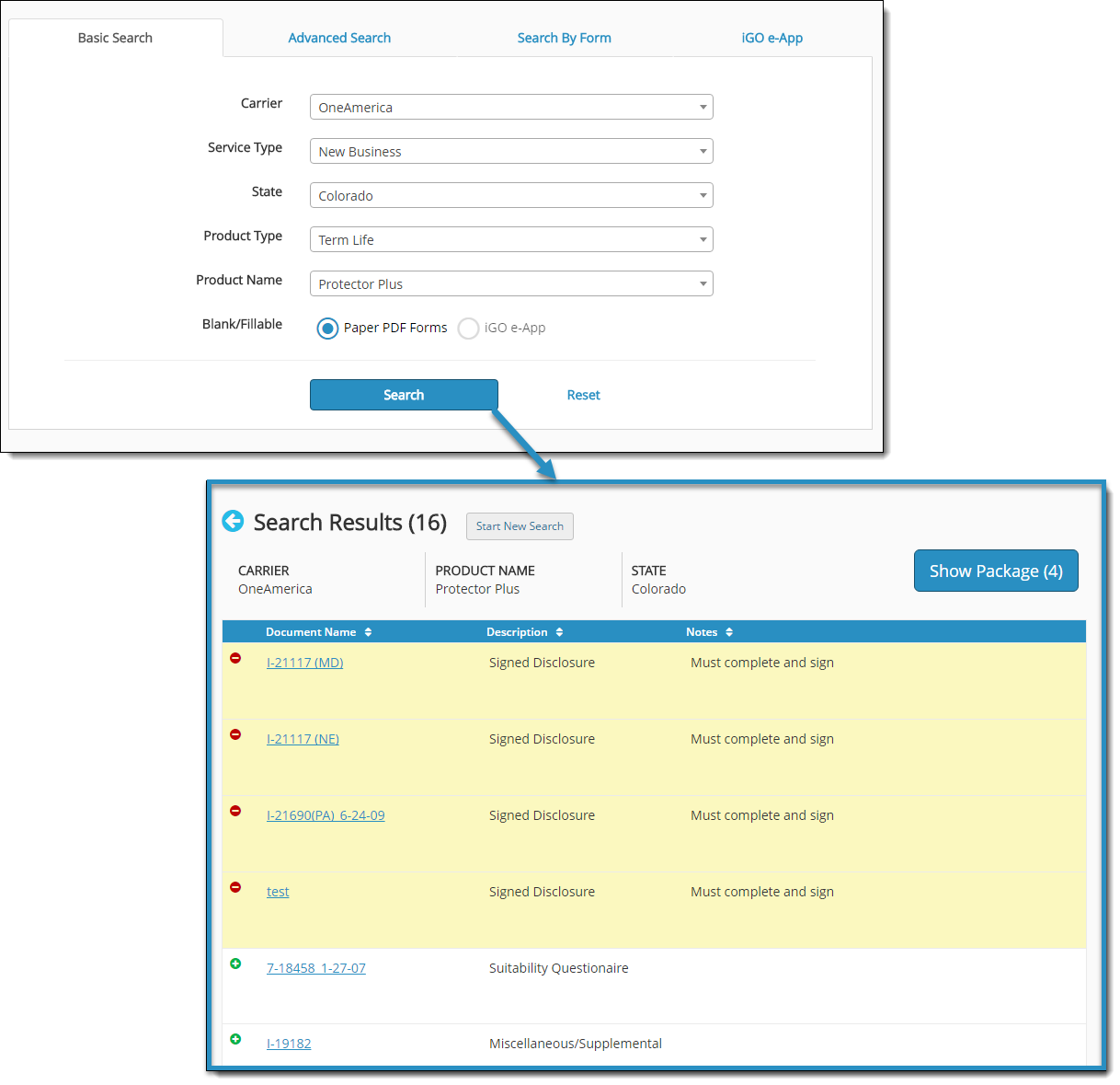
Small Devices
Tablets (>768px)
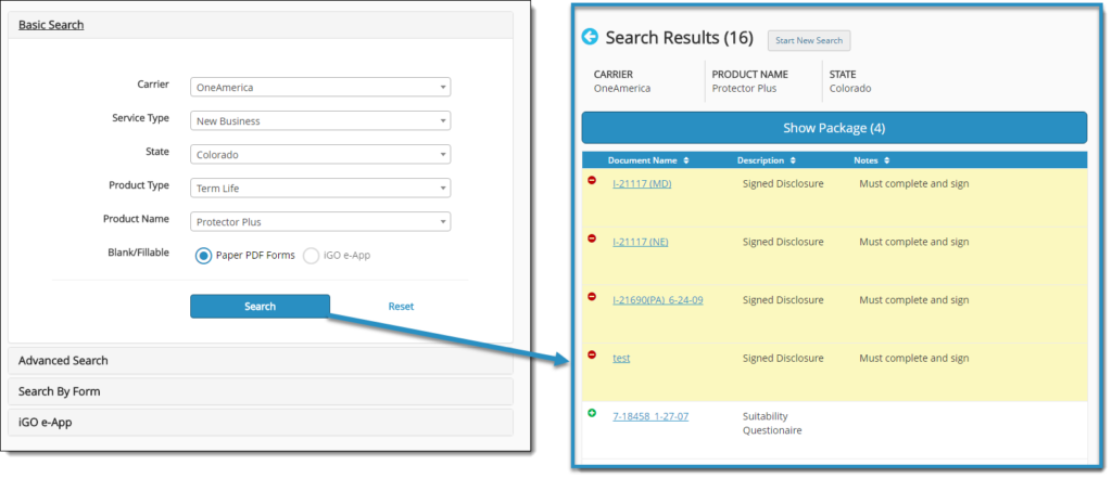
Small Devices
Phones(<768px)